I led the framing, the workflow model, and the component consolidation. I ran design reviews with operators for direct feedback, and VQA on the shipped code.
Paramount · Live CMS · Summit
Channel Operations Redesign
Operators run live events from Summit. Channel Ops controls forced them to work across the full browser screen.
The redesign keeps the match responsive and gathers every action into one control panel. Operators and Product signed off. It shipped. Operators can finish their tasks more efficiently than before.
This project covered only the Operations controls. Input/Output, Channel Health, Failover, Clipping, and Operation History stayed in the same shell.
Game-Time Critical Actions
Roll the pre-game slate. Confirm the channel is on air. Go live, or roll the technical-difficulty slate. Fire an ad break. Drop markers for the backend. Update start, end, and expiration times for VOD creation. A bad minute is public. The useful screen leaves the operator’s eyes on the picture and their hands on the controls. No searching, no scrolling, pure control within reach.
Second paragraph. Add the detail that did not fit in the first.A bad minute is public. The useful screen leaves the operator’s eyes on the picture and their hands on the controls. No searching, no scrolling, pure control within reach.
What the Old Screen made harder
- 1The match feed shared the page with operation controls, markers, thumbnails, tags, and a six-field timing grid.
- 2 Ad break, markers, and timing each appeared as more than one pattern, so the same job was harder to recognize.
- 3Time controls lived in a dense block away from the live controls, with a separate edit path from go-live and ad break.
1 The match is one panel among many. Taking action means looking away from the broadcast.
2 Ad break is a form. Length, Trigger, and Dump Out make the decision more complex.
3 Timing is its own grid. Six fields, and only four of them are pertinent during the match.
Critical Actions, Critical Decisions
The panel sits under the live feed. Each action has one control. The resting state leaves the field of vision clear, and taking action is a deliberate step.
Consistency had to carry the information operators need at that moment. Time controls got shorter. Slates, Ad Break, and Markers folded into dropdowns, so the same pattern repeats and the action is faster to fire.
Keep it simple
- 1 Fold actions into one panel for quick access and quick decisions.
- 2Remove information that belongs on another screen, including tags and VOD thumbnails.
- 3 Make the live feed the focal point, so operators can review the game when the feed is in trouble.
1 The match is the screen. The player holds the frame. Controls have moved underneath it.
2 One control per job. Go Live, Slate, Ad Break, Markers, and JAB share one row.
3 Timing sits under the dock. Edit opens the row, and Cancel and Save Changes write those values back to the CMS.
One Pattern to Control Them All
The production UI had drifted from the design library. I rebuilt the Operations screen from what was actually live, then reused components from other screens, including status chips, as indicators for when an action was active or set.
Consistency had to carry the information operators need at that moment. Time controls got shorter. Slates, Ad Break, and Markers folded into dropdowns, so the same pattern repeats and the action is faster to fire.
The Session That Moved the Panel
Once the form column became the control panel, I reviewed it on a working call with operators, Product, and Development. One operator runs the tool as a super user. We walked each action on its own.
The note that changed the design: dropdowns were covering the feed. The menu unfolded above the button and sat on the picture. The operator called it out. The dropdowns now open below the control, clear of the feed.
What Shipped, and What Is Next
Operators, Product, and Development signed off. The control panel shipped in Summit, and operators could run events more effectively.
The window is a responsive feed and control panel. Some operators opened four windows and ran four events side by side. The follow-up was a multi-match control station, using this responsive design as the starting point.
Input/Output, Channel Health, Failover, Clipping, and Operation History were outside the scope. They were left out of this project on purpose.
What I would measure next
I would time the old screen before a rebuild like this, and count missed or repeated actions. That baseline is what I would test the redesign against: speed of task completion, and errors during the flow. Those numbers would show the distance between the old screen and the new one.
What I would change
I was not given time to push for more consistent components or for accessibility. That needs an audit and developer backing. Then I could write documentation for consistency, and give development contrast-compliant 4.5:1 ratios to refactor against.
More Selected Works
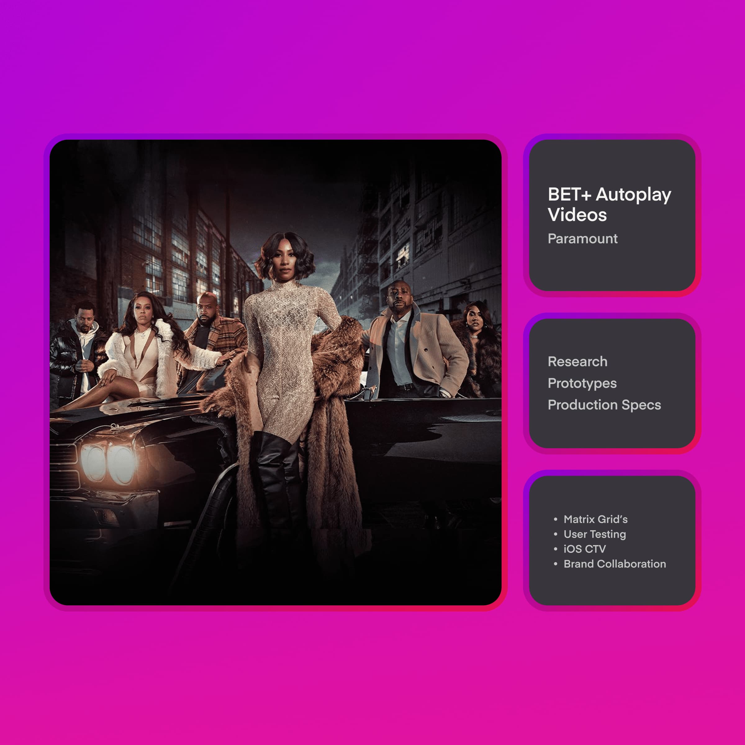
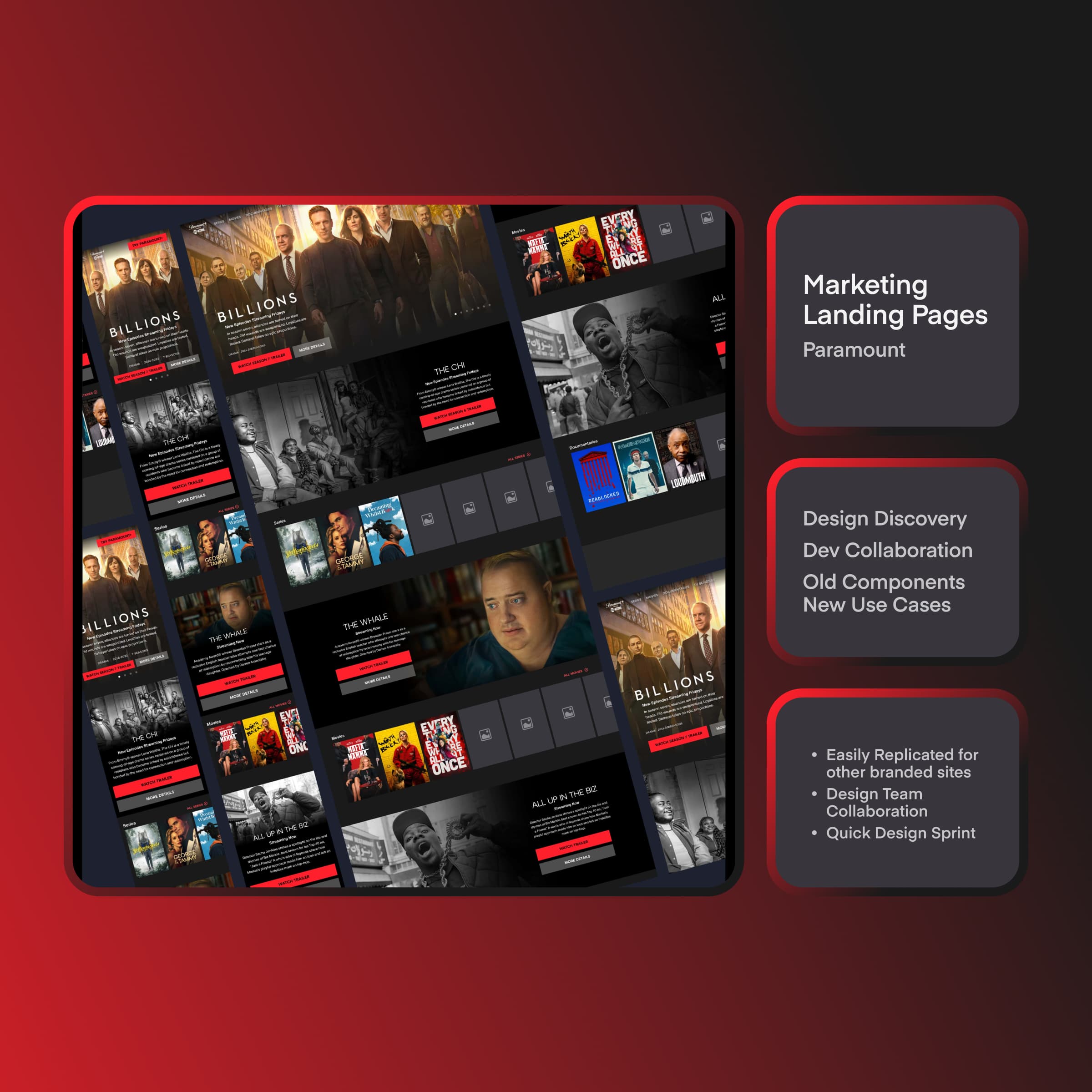
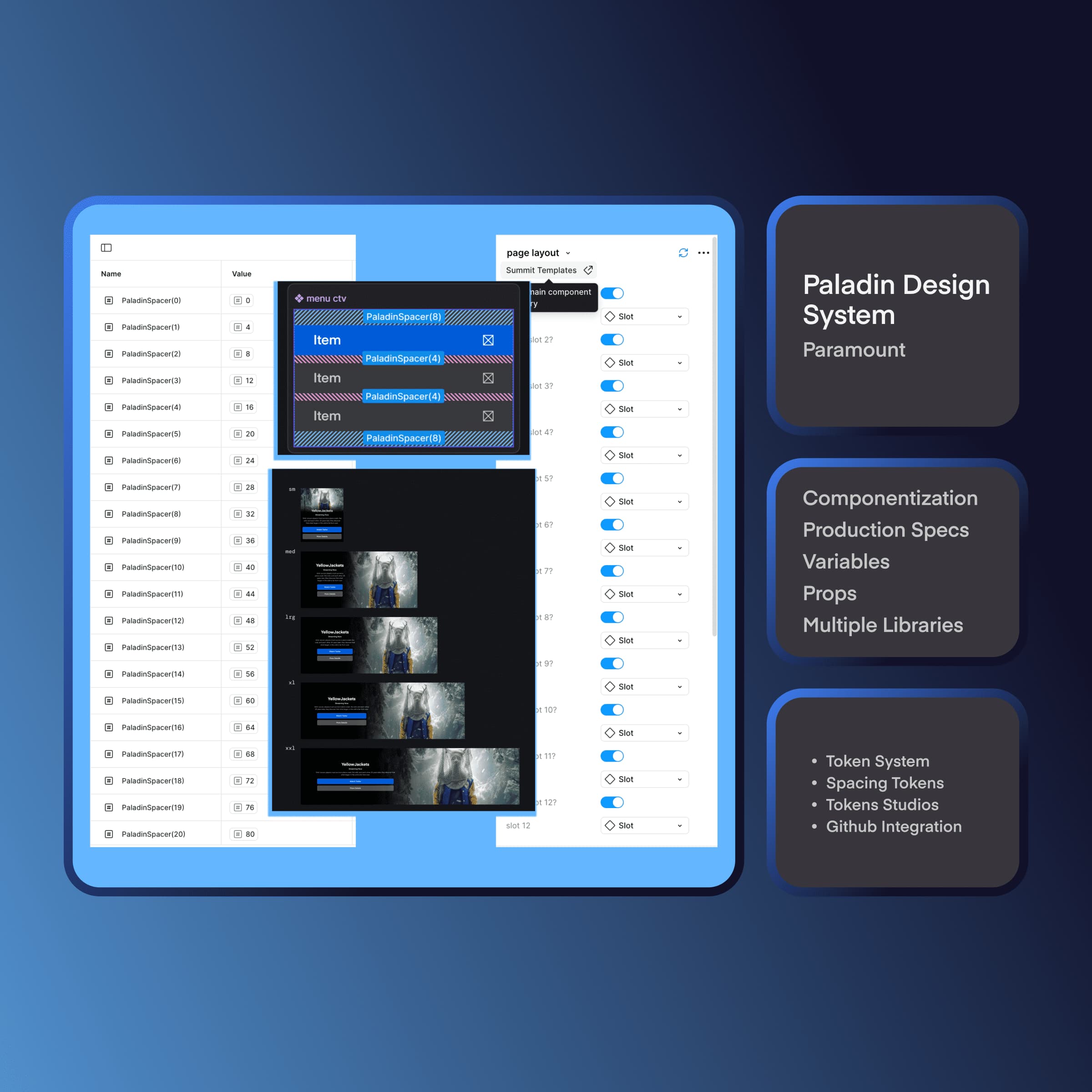
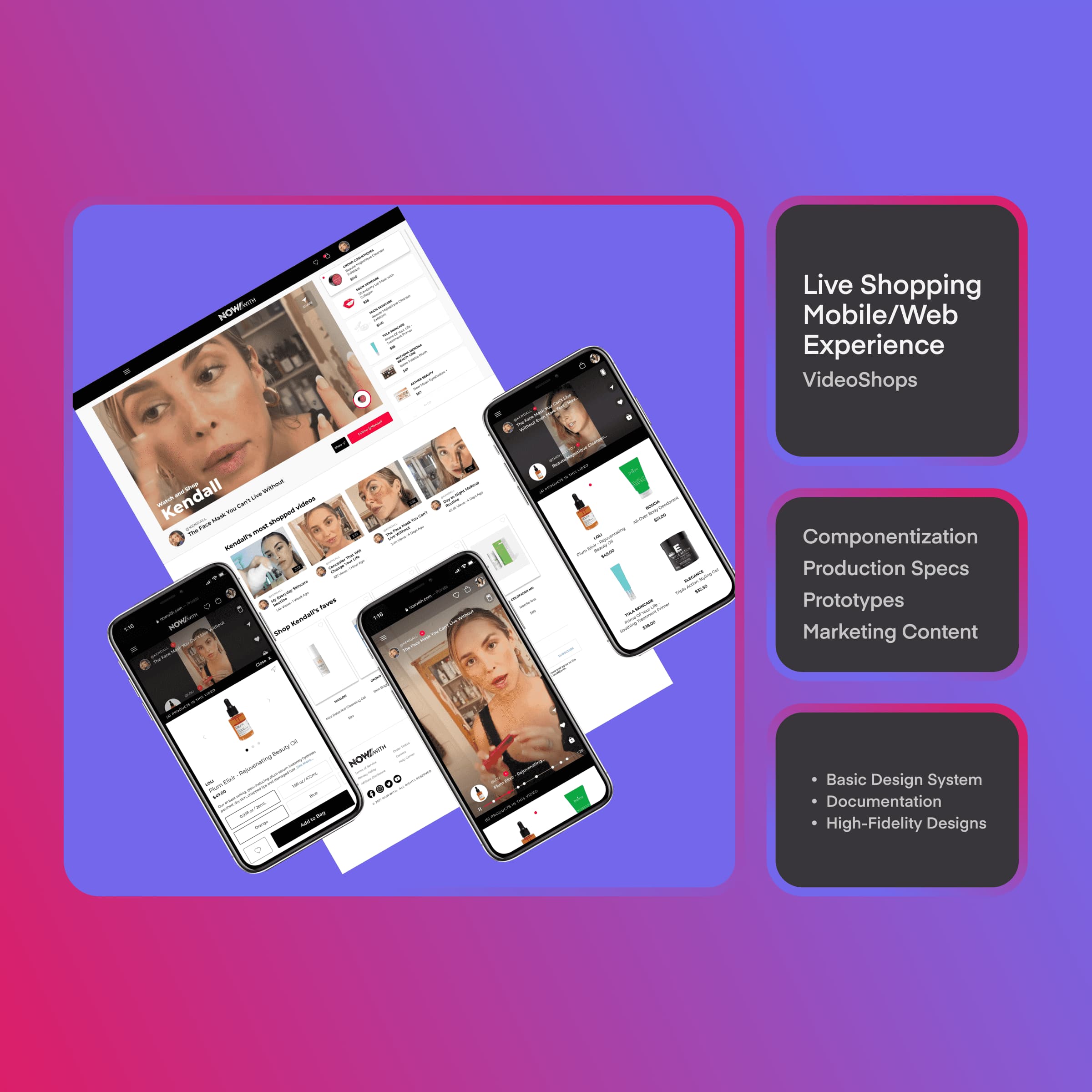
ImageCompanyProject title
One sentence on what this project was for.
ImageCompanyProject title
One sentence on what this project was for.
ImageCompanyProject title
One sentence on what this project was for.
ImageCompanyProject title
One sentence on what this project was for.